Toronto real estate prices are still drifting lower as we enter 2026. On a year-over-year basis, declines are showing up across most segments, but the magnitude of those declines varies widely. Condos in the 416 and detached homes in the 905 are down roughly 9 percent year over year, while freehold housing inside the City of Toronto, particularly semis and detached homes, is only down about 1 to 2 percent.
Prices are coming down, but they are not coming down evenly. This is not a broad Toronto market problem. It is a product-type problem.
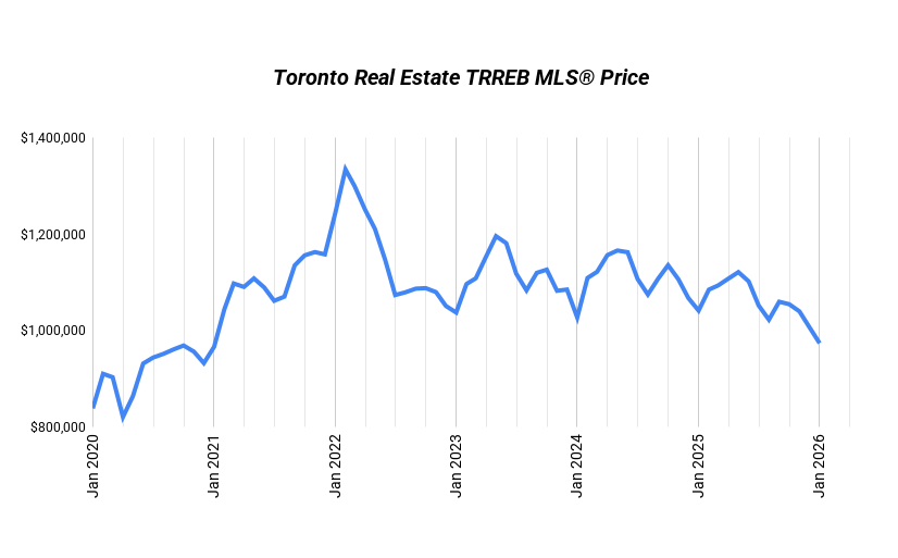
Market Overview
| Segment | Jan 2025 | Jan 2026 | Change |
|---|---|---|---|
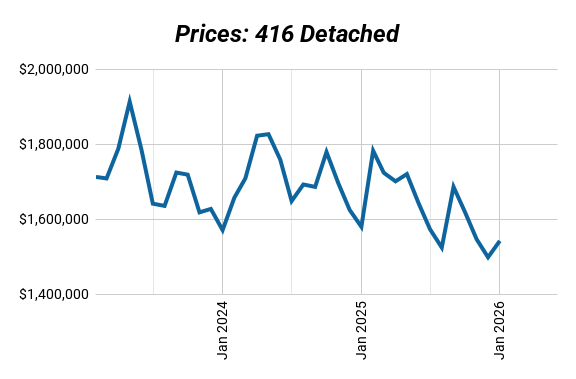
| 416 Detached | $1,579,386 | $1,541,791 | -2% |
| 416 Semi | $1,154,505 | $1,146,188 | -1% |
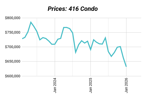
| 416 Condo | $691,039 | $631,932 | -9% |
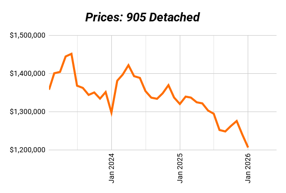
| 905 Detached | $1,319,751 | $1,205,859 | -9% |
Condos Remain the Primary Pressure Point
The condo segment continues to absorb the bulk of the market adjustment. Sales-to-listings data shows a clear imbalance between supply and demand, with far more units for sale than buyers willing to step in. Absorption rates remain well below historical norms, and prices are still materially below peak levels.
This is not simply seasonal weakness or short-term sentiment. Investor-heavy ownership, weaker cash flow at current rates, and a lack of buyer urgency are all showing up clearly in the data. The oversupply in condos is still working through the system, and price pressure has not fully cleared.
Freehold Housing Is Not One Market
Looking only at broad freehold numbers can be misleading. While sales-to-new-listings ratios for 416 and 905 detached homes appear similar on the surface, the price behaviour underneath tells a different story.
In the City of Toronto, detached prices are relatively flat year over year. Sales volumes are lower, but supply is thinner and buyers are still active when properties are priced realistically. This suggests selective demand rather than outright rejection.
In the 905, detached homes continue to correct. Affordability remains the primary constraint, inventory levels are higher, and buyers are capped by monthly payments rather than confidence. Even with similar headline metrics, the underlying market dynamics are not the same.
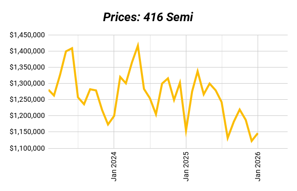
Semis Are Quietly the Most Balanced Segment
Among all major housing types, semis in the 416 stand out as the most balanced. Year-over-year price declines are minimal, absorption rates are stronger than other segments, and demand is largely end-user driven.
Semis sit in the affordability sweet spot and are less exposed to investor selling pressure. The data suggests this segment is closer to equilibrium than the rest of the market.
What is SNLR (Sales-to-New-Listings Ratio) and Why It Matters
| Segment | SNLR | Sales | Listings |
|---|---|---|---|
| 416 Detached | 29% | 290 | 1,007 |
| 416 Semi | 41% | 96 | 234 |
| 416 Condo | 24% | 568 | 2,416 |
| 905 Detached | 30% | 1,062 | 3,500 |
The Sales-to-New-Listings Ratio (SNLR) shows how hot or cold the market is by measuring how many homes are selling compared to how many are being listed.
- Seller’s Market (SNLR above the dotted line): More buyers than sellers. Homes move fast, competition heats up, and prices usually rise.
- Buyer’s Market (SNLR below the dotted line): More listings than buyers. Homes sit longer, buyers have leverage, and prices tend to soften.
- Balanced Market (SNLR near the dotted line): Supply and demand are in sync. Prices stay relatively stable.
Every market has its own version of that dotted line, but the trend matters most — if SNLR is rising, the market’s tightening. If it’s falling, buyers are gaining ground.
Sales-to-new-listings ratios moved higher in December, but this should be interpreted carefully. With many listings held back during the holidays, SNLR tends to overstate market tightness at year-end. The trend over several months remains more informative than a single December reading.
How to Read January Data Properly
December-to-January month-over-month comparisons tend to distort reality. December is consistently skewed by the holidays, with sharply reduced listings and artificially high absorption rates. January primarily reflects inventory returning to normal levels.
For a clearer view of market direction, year-over-year trends, sales versus listings by product type, and comparisons to historical absorption rates provide far more reliable signals. All three metrics point to the same conclusion.
The Real Takeaway for 2026
In 2026, the market isn’t bailing anyone out. But the right product, bought with the right strategy and supported by real cash flow, can still work very well.
This is no longer a market where appreciation fixes weak fundamentals. Product selection matters. Entry price matters. Execution matters. The market is no longer doing the heavy lifting.
At Elevate, this isn’t just a concept for us — it’s our day-to-day work.
We actively buy, renovate, build, lease, and manage multiplex properties, and we apply the same disciplined, data-driven approach to our clients’ projects as we do to our own.
That means clear numbers, practical planning, and long-term execution — from acquisition through operations.
Want to see what’s possible for you? Book a strategy session with us here.
